Water and sculpture by Toscoquattro
Water and sculpture by Toscoquattro
An unmistakable collection, for the meditated simplicity and elegance of its design
We asked Gianluca Gruarin, brand identity manager at ITALIAN CREATION GROUP, to explain some choices related to printing and binding techniques for the creation of the new Toscoquattro catalog.
Gianluca, explain us the choice to use the technique of lamination of the brand on the cover ...
The recent rebranding of the company also included the creation of a brand; the letter Q by Toscoquattro, the beating heart of the logotype, becomes the protagonist on the cover through a form that recalls ancestral symbols immediately recognizable as water sources. The choice of copper foil combined with a gray material cardboard in noble paste the brand conveying precious and suggestive tactile sensations.
Leafing through the print we notice a booklet in the catalog, why this choice?
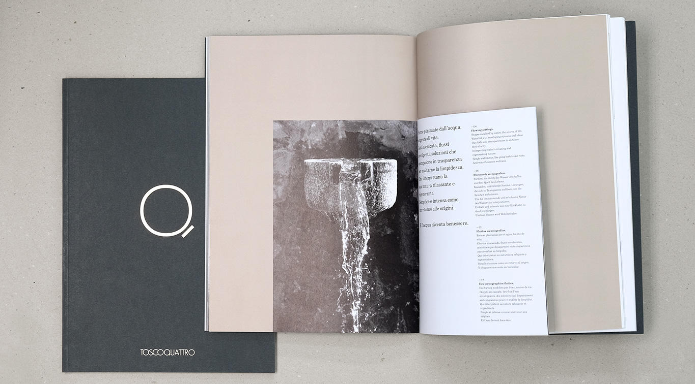
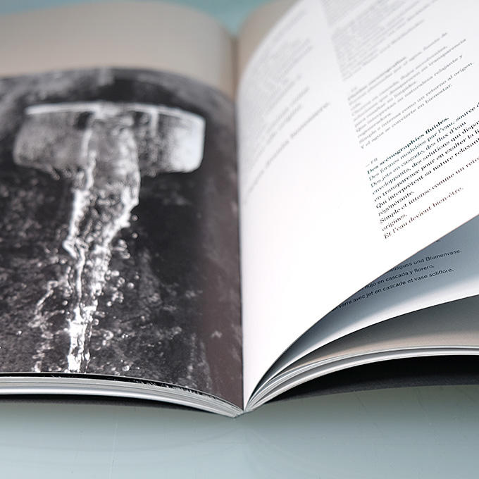
SCENOGRAFIE FLUIDE has been designed to enclose and tell the original Toscoquattro taps that interprets the relaxing and regenerating nature of water with cascading jets, enveloping flows and solutions that disappear in transparency.